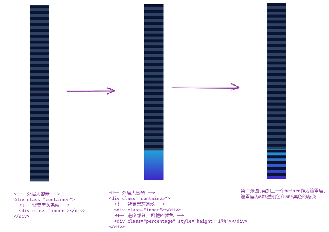
效果图:

- html结构
<div class="container">
  <div class="inner"></div>
	<div class="percentage" style="height: 17%"></div>
</div>
- css结构
body {
  background: #e4e4e4;
}
.container {
  width: 20px;
  height: 180px;
  position: relative;
}

.inner {
  width: 20px;
  height: 180px;
  background: linear-gradient(0deg, #2d4264 50%, #0a1431 50%);
  background-size: 100% 6px;
}
.percentage {
  position: absolute;
  bottom: 0;
  width: 20px;
  background: linear-gradient(to bottom, #24a1d8 0%, #3e25c8 100%);
}

.percentage::before {
  content: "";
  position: absolute;
  bottom: 0;
  height: 180px;
  width: 20px;
  background: linear-gradient(0deg, transparent 50%, #0a1431 50%);
  background-size: 100% 6px;
}
- 整体流程