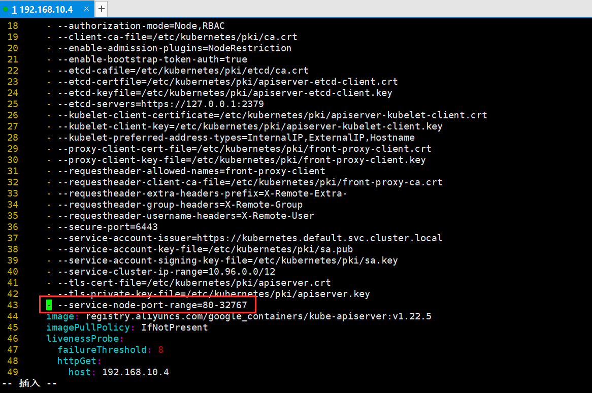
vue 适配屏幕分辨率,以及屏幕的缩放
在考虑 笔记本 或者 显示器 默认设置125%或者150%缩放,导致布局错乱的解决方法

一、为什么会出现有这个问题?
- 因为现在很多14寸的笔记本,出厂默认就是150%的显示。导致很多时候我们的项目,自己开发的时候都是按照100%比例来开发的,上线了就会发现这个问题。
vue项目util下新建js1、文件名devicePixelRatio.js

class DevicePixelRatio { constructor() { // this.flag = false; } // 获取系统类型 _getSystem() { // let flag = false; var agent = navigator.userAgent.toLowerCase(); // var ismac = /macintosh|mac os x/i.test(navigator.userAgent); // if(isMac) { // return false; // } // 现只针对windows处理,其它系统暂无该情况,如有,继续在此添加 if (agent.indexOf('windows') >= 0) { return true; } } // 获取页面缩放比例 // _getDevicePixelRatio() { // let t = this; // } // 监听方法兼容写法 _addhandler(element, type, handler) { if (element.addEventListener) { element.addEventListener(type, handler, false); } else if (element.attachEvent) { element.attachEvent('on' + type, handler); } else { element['on' + type] = handler; } } // 校正浏览器缩放比例 _correct() { let t = this; // 页面devicePixelRatio(设备像素比例)变化后,计算页面body标签zoom修改其大小,来抵消devicePixelRatio带来的变化。 document.getElementsByTagName('body')[0].style.zoom = 1 / window.devicePixelRatio; } // 监听页面缩放 _watch() { let t = this; t._addHandler(window, 'resize', function() { // 注意这个方法是解决全局有两个window.resize // 重新校正 t._correct() }) } // 初始化页面比例 init() { let t = this; if (t._getSystem()) { // 判断设备,目前只在windows系统下校正浏览器缩放比例 // 初始化页面校正浏览器缩放比例 t._correct(); // 开启监听页面缩放 t._watch(); } } } export default DevicePixelRatio; 2、全局导入App.vue