Toyplot:一个简洁、可爱的Python的交互式数据可视化绘图库
2020-07-22
加入收藏
1 说明:
=====
1.1 Toyplot是一个Python的交互式绘图库,可用于数据可视化、绘图、文字,用各种形式展示。
1.2 为科学家和工程师们提供简洁的界面。
1.3 可开发美丽的交互式动画,以满足电子出版和支持repoducibility的独特功能。
1.4 创建最佳的数据图形"out-of-the-box"。

2 准备:
=====
2.1 官网:
https://github.com/sandialabs/toyplot
https://toyplot.readthedocs.io/en/stable/
2.2 安装:
pip install toyplot
#本机安装
sudo pip3.8 install toyplot
#推荐国内源安装
sudo pip3.8 install -i https://mirrors.aliyun.com/pypi/simple toyplot
2.3 环境:
华为笔记本电脑、深度deepin-linux操作系统、谷歌浏览器、python3.8和微软vscode编辑器。
3 折线图:
=======
3.1 本代码:为注释版
#line==折线图
import toyplot as tp

x=['1','2','3','4','5','6']

#y=[31,22,55,41,66,17]  #1组数据

y=[[31,22],[22,17],[55,34],[41,28],[66,43],[17,36]] #2组数据

canvas = tp.Canvas(width=300, height=300,) #方法一,画布大小设置
#方法二:style=类似与css设置
#canvas = tp.Canvas("6in", "6in", style={"background-color":"pink"})

#坐标轴axes的标签名
axes = canvas.cartesian(xlabel='序号',ylabel='data')
#线条颜色color设置
#mark = axes.plot(x, y,color='red')  #1组颜色设置

mark = axes.plot(x, y,color=['red','green'])  #1组颜色设置

#水平图例==horizontal-legends
markers = [mark + tp.marker.create(shape="o") for mark in mark.markers]
axes.label.text = markers[0] + "  dog  " + markers[1] + "  pig"

#浏览器自动打开,推荐这种
import toyplot.browser
tp.browser.show(canvas)

#生成pdf
#import toyplot.pdf
#tp.pdf.render(canvas, "/home/xgj/Desktop/toyplot/1-line.pdf")

#生成png图片
#import toyplot.png
#tp.png.render(canvas, "/home/xgj/Desktop/toyplot/1-line.png")

#生成html
#import toyplot.html
#tp.html.render(canvas, "/home/xgj/Desktop/toyplot/1-line.html")

'''
#生成svg图片
import toyplot.svg
svg = tp.svg.render(canvas)
svg.attrib["class"] = "MyCustomClass"
import xml.etree.ElementTree as xml
with open("/home/xgj/Desktop/toyplot/1-line.svg", "wb") as file:
    file.write(xml.tostring(svg))
'''
3.2 上述代码简洁版:
#line==折线图
import toyplot as tp
x=['1','2','3','4','5','6']
y=[[31,22],[22,17],[55,34],[41,28],[66,43],[17,36]] #2组数据
canvas = tp.Canvas(width=300, height=300,) #画布大小设置
#坐标轴axes的标签名
axes = canvas.cartesian(xlabel='序号',ylabel='data')
#线条颜色color设置
mark = axes.plot(x, y,color=['red','green'])
#水平图例==horizontal-legends
markers = [mark + tp.marker.create(shape="o") for mark in mark.markers]
axes.label.text = markers[0] + "  dog  " + markers[1] + "  pig"
#浏览器自动打开,推荐这种
import toyplot.browser
tp.browser.show(canvas)
3.3 操作和效果图:
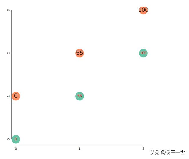
4 散点图:
========
4.1 代码:
import toyplot

canvas = toyplot.Canvas(width=500, height=500)
axes = canvas.cartesian()
m0 = axes.scatterplot([0, 1, 2], [0, 1, 2], size=25)
m1 = axes.text([0, 1, 2], [0, 1, 2], ["0", "55", "100"], color="red")

marks = []
for label in ["0", "55", "100"]:
    marks.Append(toyplot.marker.create(
        shape="o",
        label=label,
        size=25,
    ))
m2 = axes.scatterplot([0, 1, 2], [1, 2, 3], marker=marks)
#浏览器自动打开,推荐这种
import toyplot.browser
toyplot.browser.show(canvas)
4.2 图:
5 垂直堆砌柱状图:
==============
5.1 代码:
#bars==垂直堆砌柱状图=vsbar
import toyplot as tp
x=['1','2','3','4','5','6']
#y=[31,22,55,41,66,17]  #1组数据
y=[[31,22],[22,17],[55,34],[41,28],[66,43],[17,36]] #2组数据
canvas = tp.Canvas(width=300, height=300,) #方法一,画布大小设置
#方法二:style=类似与css设置
#canvas = tp.Canvas("6in", "6in", style={"background-color":"pink"})
#坐标轴axes的标签名
axes = canvas.cartesian(xlabel='序号',ylabel='data')
#线条颜色color设置,2组颜色设置
mark = axes.bars(x, y,color=['red','green'])
#水平图例==horizontal-legends
markers = [mark + tp.marker.create(shape="o") for mark in mark.markers]
axes.label.text = markers[0] + "  dog  " + markers[1] + "  pig"
#浏览器自动打开,推荐这种
import toyplot.browser
tp.browser.show(canvas)
5.2 图:

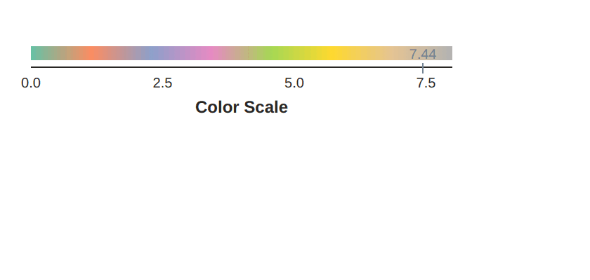
6 颜色条:
=======
6.1 代码:
#Color Scale
import numpy
import toyplot
colormap = toyplot.color.LinearMap(toyplot.color.Palette(), domain_min=0, domain_max=8)
canvas = toyplot.Canvas(width=400, height=100)
axis = canvas.color_scale(colormap, label="Color Scale", scale="linear")
axis.axis.ticks.locator = toyplot.locator.Extended(format="{:.1f}")
#浏览器自动打开,推荐这种
import toyplot.browser
toyplot.browser.show(canvas)
6.2 图:
7 table-heperlinks:
==============
7.1 表格块状图及链接和图示文字。
7.2 代码:
#table-heperlinks
import numpy
import toyplot
canvas, table = toyplot.table(rows=4, columns=4)
table.cells.grid.hlines[...] = "single"
table.cells.grid.vlines[...] = "single"
#填充颜色
table.cells.cell[1,1].style = {"fill":"crimson"}
#可以指定链接地址
table.cells.cell[1,1].hyperlink = "http://toyplot.readthedocs.io"
table.cells.cell[2,2].style = {"fill":"seagreen"}
#可以指定链接地址
table.cells.cell[2,2].hyperlink = "http://www.sandia.gov"
table.cells.cell[3,3].style = {"fill":"royalblue"}
table.cells.cell[3,3].title = "This is a cell!"
#浏览器自动打开,推荐这种
import toyplot.browser
toyplot.browser.show(canvas)
7.3 图:

8 高级作图之动态散点图:
====================
8.1 代码:
#散点动画图
import numpy
x = numpy.random.normal(size=100)
y = numpy.random.normal(size=len(x))

import toyplot
canvas = toyplot.Canvas(300, 300)
axes = canvas.cartesian()
mark = axes.scatterplot(x, y, size=10)

for frame in canvas.frames(len(x) + 1):
    if frame.number == 0:
        for i in range(len(x)):
            frame.set_datum_style(mark, 0, i, style={"opacity":0.1})
    else:
        frame.set_datum_style(mark, 0, frame.number - 1, style={"opacity":1.0})

#保存为mp4
#toyplot.mp4.render(canvas, "/home/xgj/Desktop/toyplot/test.mp4", progress=progress)
#浏览器自动打开,推荐这种
import toyplot.browser
toyplot.browser.show(canvas)
8.2 效果图:

===自己整理并分享出来===
喜欢的人,请点赞、关注、评论、转发和收藏。